Description
Take a photo considering the elements of design, then edit it in photoshop and create a project that emphasizes the color scheme used.
Process
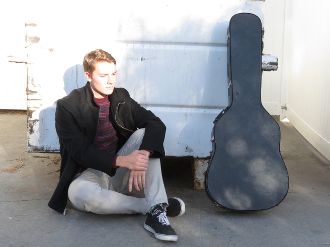
I took a few additional photos when I was out taking photos for my last as signment. While taking them, I considered the rule of thirds and leading and got this shot. After that, I sketched a few ideas for my project. The initial idea I had when presented with the details of the project was the top-left one, but it didn’t translate from my head to the page very well. As it turns out, it was a cool idea, but in practice did not look very good.Maybe I can build off of that idea for another project; it just wasn’t right for this one. I went with the one in the bottom-right, as it seemed like it would be the best way to present a color scheme.
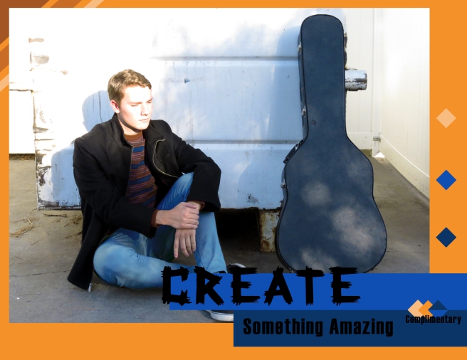
On opening the photo in Photoshop, I realized that the picture I wanted to use for this project did not really have much of a color scheme. My roommate Tanner, who is in the photo, had on a shirt that was red and grey, and his pants were white. While I could have gone with a monochromatic color scheme focusing on either all black and white or shades of red and black, I’ve been sticking to monochromatic color schemes pretty often, and I wanted to poke at the edges of it a bit this time. So I decided to change some things in the photo.
I used the selection tool to select certain parts of Tanner’s shirt, then used the selective color function to change the main color from red to orange. I did the same for the secondary color, only this time changing it from a dark grey to a blue. I then selected his pants, and changed them to blue. I spent a long time tweaking these colors, as it was tough to make them not look totally unnatural. After a while, I managed to get somewhere I felt good about. There was still something odd about it though. Turns out, thanks to my use of the selection tool, I had some sharp edges around the selected areas. I used the blur tool to mitigate this.
Once I had the photo the way I wanted it, I opened a new file in photoshop, set it to the right size, and dragged my photo onto it. I set the background to orange, using the eyedropper tool to make sure I got the right shade. I then used the shape tool to make the blue rectangles. I made another shape that was a lighter shade of orange, and reordered the layers so that it would appear underneath the photo. I used the text tool to write the text, choosing two contrasting fonts. Unfortunately, I was struggling to find fonts that fit my theme in the default, so I went with something I was unhappy with. This poor font choice didn’t make it to the final design, though. After that I used the shape tool to make the four squares I was using for my color swatches.
Critique Process
After submitting my draft, I got some critique from my instructor. She didn’t like the choice of font, either. She also said that the design was a little too “boxy,” which I agreed with. She suggested I bring the photo down farther, change the font, and bring the color swatches closer together and present them differently. She also suggested I have the text bleed off of the rectangles a bit, to make it more dynamic.
I went back to the design, trying to decide how to fix it. I went online to search for fonts, since I was unhappy with any of the options available to me at that time, and found a new one. I still don’t feel that it’s perfect, but it is significantly better. I also moved it up slightly so it bled over onto the photo a bit, too. When attempting to resize the image and make it take up more of the frame, I accidentally just moved it down slightly diagonally. Though it was an accident, I liked the way it looked way, way more. I also had the idea to change the color swatches to a diamond shape, and bring them down towards the middle of the two rectangles. While fiddling around with that a bit, I thought it would look good to layer them over one another, and it did! So I adjusted the swatches until I thought they looked just right. I took out the large square of lighter orange I had in in the background in order to make it look less boxy, but then I found the negative space on the side of the photo distracting. I added in more of my color swatch diamonds, and that mitigated it a bit.
I wanted to minimize the boxy-ness even further, so I went about doing something to the corner of my photo. At first, I layered rectangles over it in a sort of stripey pattern. I didn’t love the way it looked. Then I thought to have them behind the photo, and it looked way better. It lowered the oppressive feeling of the square shape without being in-your-face and distracting from the focus of the image, the photo.
Message
To inspire creativity.
Audience
Students, primarily. Maybe seeing this cool guy being all cool will inspire them to try to be cool too, and do something creative.
Top Thing Learned
I hated my first pass on this thing. I thought it looked atrocious. I’m still not happy with it, though I like it significantly more in this final iteration than the first pass I did. But when I got my critique, my instructor didn’t think it was so bad. There were obviously things that could be improved, but I was under the impression that it was an unsalvageable mess. I was ready to give up on it entirely. I guess the number one thing I learned is that while it is important to be critical of your own work, being so critical of it that it impedes your ability to improve it is easy to do. Getting a second opinion from others is extremely important in design, not just to point out the problems, but also to point out the strengths in it, too. If not for the feedback I got, I might have submitted it as it was, having resigned myself to the thought that it was garbage.
Color Scheme and Color Names
Complimentary // Orange & Blue
Title Font Name and Category
Decorative // Rockmaker
Copy Font Name and Category
Sans Serif // Haettenschweiler
Thumbnails of Unedited Images Used
Source of Images
The image is mine. Photo was taken on 10/7/2016 near my apartment.


 searched online for some images I could use, though my initial findings need me to do some photoshop work on them to make the backgrounds transparent.


